


Layering Neutrals
For effortlessly elegant interiors, master the art of layering tone, texture and light. Neutrals have long been a favourite in interiors around the world, but there’s a fine line between calming and clinical. Done well, neutral schemes are timeless, warm and deeply comforting. Done poorly, they can feel flat or uninspired. Whether you're planning a full home renovation or simply refreshing a room, these dos and don’ts will help you layer neutrals with confidence and style.
DO mix WARM AND COOL
A common mistake is sticking too closely to one end of the spectrum - too warm, and the space can feel yellowed; too cool, and it risks feeling icy. The secret lies in balance. Pair warm taupes or greiges with cooler greys or stony whites to create a more layered, liveable space. Try a warm linen sofa against cooler putty-coloured walls, or a crisp pale grey with warm-toned oak flooring.
DON’T assume ‘NEUTRAL’ MEANS WHITE or BEIGE
Neutrals encompass a wide palette - think soft greys, mushroom, sand, stone, chalk, camel, oat, clay, ivory, even muted olive or slate. These tones act as neutrals too, and can be far more interesting than stark white. In fact, many designers now favour off-whites and complex neutrals like Farrow & Ball’s Slipper Satin or Little Greene’s French Grey for added interest and warmth. Consider paints with depth and complexity, such as Edward Bulmer’s Jonquil or Coat Paints’ Pampas, which offer far more than flat beige.

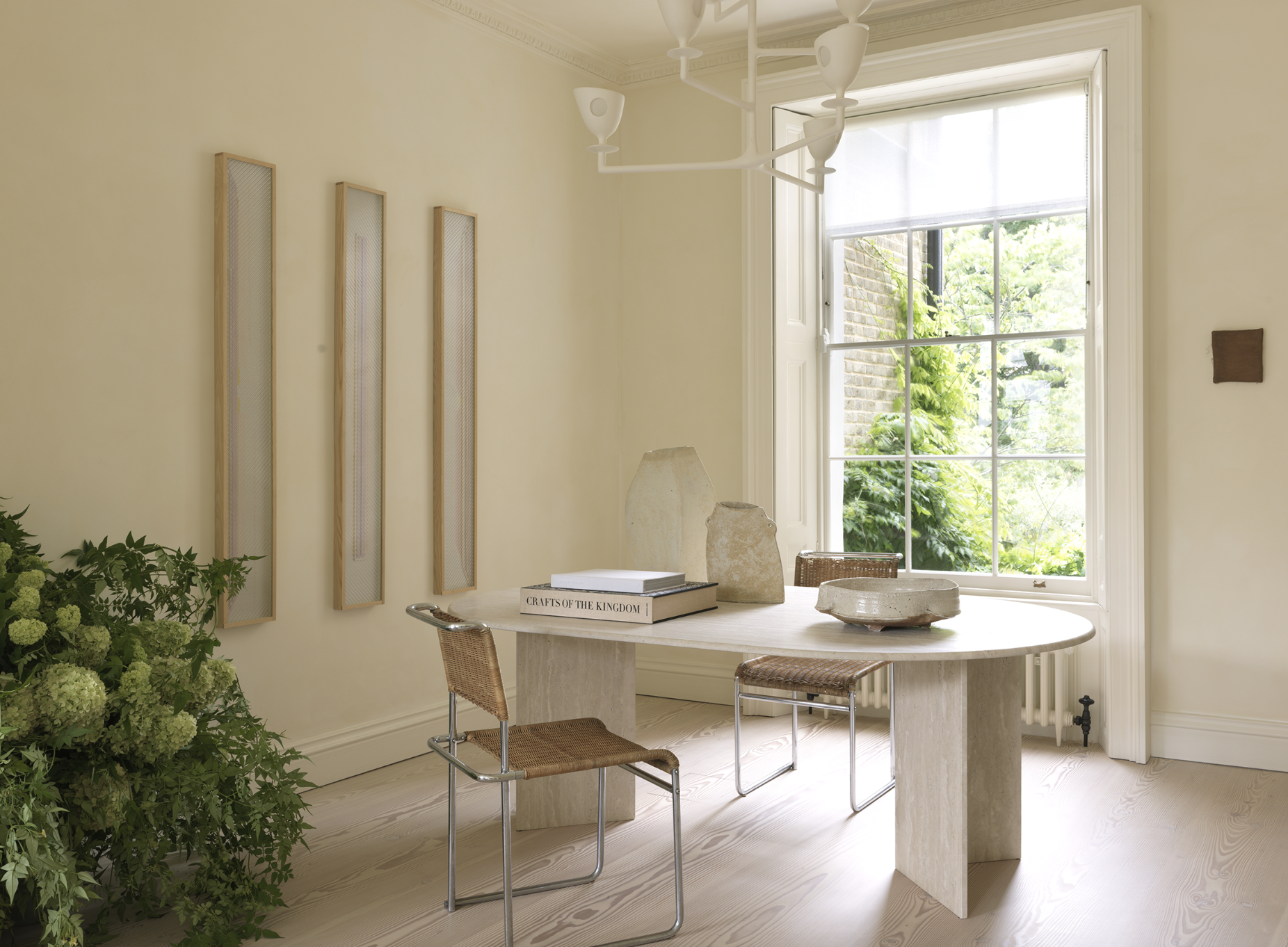
DO layer TEXTURE to CREATE INTEREST
When colour takes a back seat, texture takes the lead. This is where neutral interiors truly shine. Combine slubby linens with velvety cushions, wool throws, raw woods, aged leathers and matt ceramics. Even subtle details - a ribbed vase, boucle upholstery, or a woven lampshade - can stop a neutral room from feeling flat.
In kitchens and bathrooms, add contrast with smooth marble, brushed brass, natural wood and matte cabinetry to add tactile interest. The same applies to flooring; layer a jute rug over wooden boards, or choose a mix of tile and timber to define zones without adding bold colour.
DON’T forget ABOUT LIGHTING
Neutrals behave differently depending on the light. What looks soft and warm in a sun-drenched room can read cold and grey on a rainy afternoon. Test your paint samples in both natural and artificial light before committing. North-facing rooms benefit from warmer tones (think stone or caramel), while south-facing rooms can handle cooler greys or putty shades.

Layer your lighting, too. Combine ceiling spots or pendants with warm-toned lamps and wall lights to create depth and atmosphere, especially in the evenings.
DO use CONTRAST TO KEEP things DYNAMIC
Without contrast, even the most carefully curated neutral room can feel washed out. Add definition with black or dark bronze hardware, chocolate-toned woods, or accents of charcoal and inky blue. Think of it like eyeliner for your interior, it sharpens the whole look.
Dark-framed art, black steel Crittall-style doors, or a smoky glass pendant can all ground a pale scheme beautifully.
DON’T match EVERYTHING
Too much coordination kills character. Mixing tones and finishes keeps a neutral palette from feeling staged. Your dining table doesn’t have to match the chairs, and your cushions shouldn’t all be the same fabric or shade. Layering is key; just as in fashion, a mix of textures and tones creates richness.
If you’re choosing neutrals for walls and furniture, go for graduated tones rather than trying to colour match. For example, soft mushroom walls paired with a chalky beige sofa and deeper taupe curtains.
DO treat WOOD AND NATURAL materials AS NEUTRALS
Wood, rattan, linen, marble, slate and wool all bring natural warmth to a neutral palette. Use them freely to soften modern schemes or warm up minimalist spaces. Pale oak or walnut cabinetry, travertine side tables, or woven accents add texture and richness while keeping the tone earthy and calm.


DON’T forget PERSONALITY
Neutrals don’t have to mean boring. Layer in personal touches, such as handmade ceramics, family photos, vintage finds, or even a well-chosen piece of art in muted tones. Neutral spaces often make the best backdrop for treasured objects, allowing them to shine without competing for attention.
And remember…
Neutrals are about subtlety, not simplicity. With the right layering of tone, texture, light and materials, a neutral room can feel luxurious, welcoming, and anything but dull. Take your time, trust your eye - and don’t be afraid to mix it up.

