


Our Go-To Paint Hues 2025
Colour is more than just pigment on a wall — it’s mood, it’s texture, it’s the undercurrent of a space’s story. This year, we’re leaning into hues that feel soulful, nuanced and deeply lived-in. Colours that resonate on a visceral level, drawing inspiration from nature, history and the patina of time. Warm neutrals, earthy reds, grounding greens and whisper-soft blues. Each shade thoughtfully selected, weaving together the ever-evolving story of home.
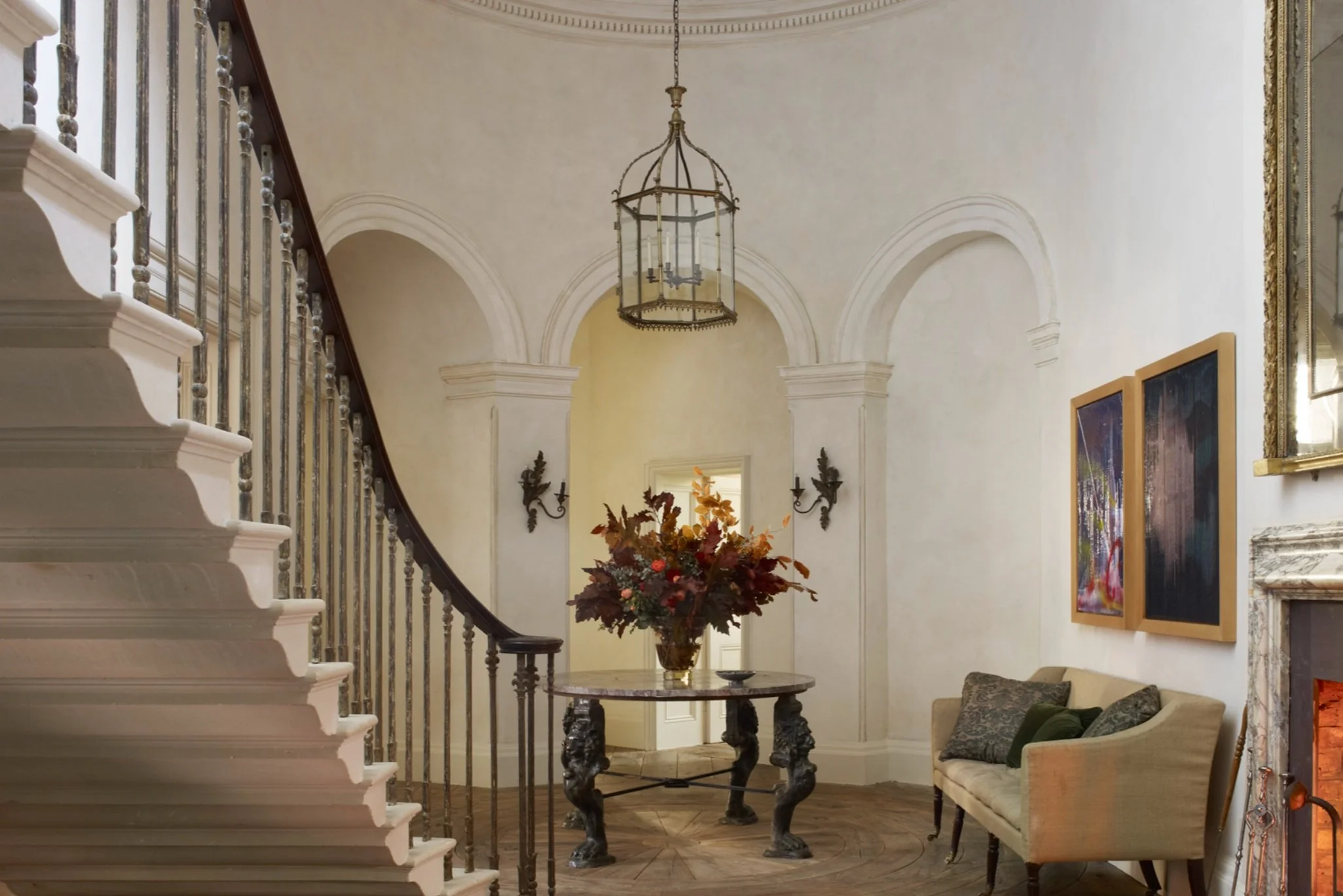
the WARMTH OF WHITE
White, but never stark. This season, we crave whites with depth — creamy, chalky and endlessly versatile. Shadow White by Farrow & Ball has that perfect muted glow, a barely-there warmth that plays beautifully with natural light. Slaked Lime by Little Greene? A quiet backdrop with just enough body to feel inviting. And for a whisper of vintage charm, Old White by Farrow & Ball carries a subtle, aged softness that pairs effortlessly with plastered walls and timeworn wood.


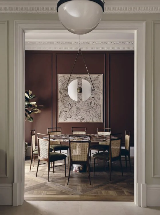
BOLD ROMANCE
Deep, moody and utterly captivating — burgundy is making a bold return. Masai by Paint & Paper Library has an old-world richness that feels both storied and modern. Meanwhile, Bauwerk’s Bloodwood and Garance harness the raw beauty of limewash, letting walls feel drenched in pigment, alive with texture. And if you’re craving that deep, enveloping cocoon? Farrow & Ball Deep Reddish Brown is the ultimate in quiet, seductive drama.
Click here to enjoy our exclusive premium member trade discount with Bauwerk


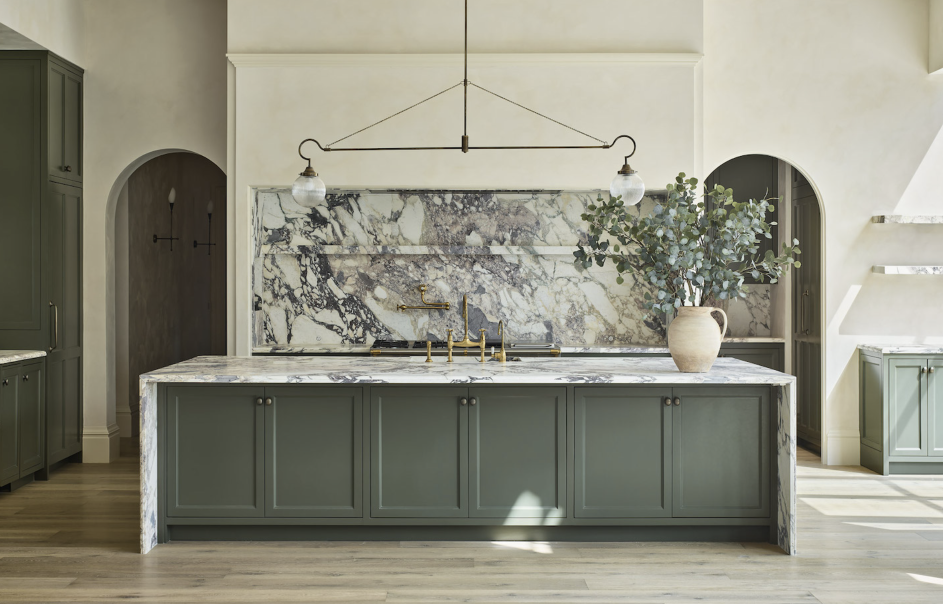
GROUNDING GREENS
Greens this year are aged, layered and effortlessly grounding. Farrow & Ball’s Lichen is that perfect weathered green — soft, mossy and ever so slightly moody. Mohegan Sage by Benjamin Moore offers a deeper, botanical richness, while Portola Paints Rococo leans into an earthy, muted tone that feels right at home in both classic and modern spaces. Think kitchen cabinetry, enveloping living rooms, or statement walls that bring the outdoors in.


the SOFT RESURGENCE of BLUE
For those craving a breath of fresh air, pale blues are having a quiet moment. Paint & Paper Library’s Blue Vein or Farrow & Ball’s Kittiwake are delicate yet intentional, adding just the right amount of cool tranquility. Farrow & Ball’s Yonder has an ethereal softness, a powdery touch that feels timeless, fresh and impossibly chic. Perfect for light-filled bedrooms, airy bathrooms, or anywhere you want to create a sense of quiet escape.


Whether you’re drawn to the enveloping warmth of an oxblood red, the timeworn patina of a warm white, or the serenity of a pale blue, these shades are an invitation. To create. To layer. To live. At No.17 House, these are the hues we’re embracing — and we can’t wait to see how they come to life in your space.
Image Sources
Rose Uniacke, Domingue, Katie Harbison, Banda

