


The Resurgence Of Brown
Since dominating Milan Design Festival last year, brown has only gained momentum as the colour of the moment and, for the converted, the best news is, it’s here to stay.
From chestnut to chocolate, tobacco to toast, brown in all its guises is the colour du jour. After years of greys, whites and black, we’re ready for something altogether warmer. It’s cocooning and cosy - in a world of artificiality, it’s no surprise that we're seeking some home comfort with a grounding tone that promotes connection to nature and the human spirit. And best of all, you can confidently embrace brown in your scheme knowing it won’t date - brown blends traditional and rustic vibes with a fresh, modern aesthetic, creating spaces that feel both timeless and contemporary. After all, unpainted wood has been a mainstay of interiors for centuries, offering warmth and interest alongside practicality and function.
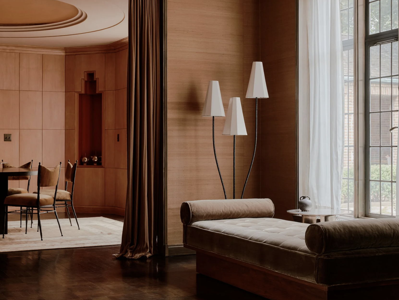
For furniture, we’re seeing a leaning towards walnut - check out Athena Calderone’s Rituelle Table for Crate and Barrel, it’s the perfect example - and mahogany antiques are appealing both for their price point and sustainability credentials. But brown is undeniably sexy too. It marries well with the current 1970s resurgence - curvaceous armchairs in rich mocha mohair or lacquered side tables in a bitter chocolate - and there’s also the faux finishes that are popular and tie in nicely, such as tortoiseshell and even leopard print. Leather, glass, resin and stone are natural partners, and while brown instinctively gravitates towards brass, try it with chrome - the contrast is seriously cool.
“AFTER ALL, UNPAINTED WOOD HAS BEEN A MAINSTAY of INTERIORS for CENTURIES, OFFERING warmth AND interest ALONGSIDE PRACTICALITY AND FUNCTION.”


Brown-based marbles for splash backs or bath surrounds incorporate lighter veining that ties in nicely to paler tones you may want to use, such as warm whites. Paint and Paper Library's Cashmere II, Farrow & Ball's Joa's White or Oxford Stone are wise choices for neutrals if you want to keep the space light and airy. Creating a layered brown-on-brown scheme is challenging to achieve - and most would agree it’s better when combined with another tone - but if you insist, the key is to vary the materials, textures and pick similar tones of brown. Using different finishes avoids monotony and adds dimension to achieve harmony, so the secret is to offset darker browns with mid and lighter tones. For a richer, moodier affect, interior designer Murude Katipoglu likes to strategically pick up on lighter tones of brown on the walls and darker tones in the upholstery. By pairing deeper chocolate tones with muted earthy shades, such a taupe and camel, you can bring richness and depth to a space.
For a look that goes beyond the tonal palette, brown is helpfully versatile. Aside from pairing with autumnal shades such as deep red, rich ochres, and soft ambers, it also can foster a happy partnership with unexpected choices. Blues, especially greyish blues, offer a tonal contrast that is sophisticated but it also grounds the brighter colour. In fact, other pastel colours such as dusty pink and butter yellow can modernise brown for a contemporary style that offers fresh balance. If you’re choosing deep, moody walls in a bedroom such as Edward Bulmer's Chocolate, go for lighter bedlinen in buff pinks with accents of dark on the pillows and throws; if your walls are light (Farrow & Ball Setting Plaster, for example), lean into a richer palette on the bed.


For those looking for a lighter touch on the trend, pattern is a good route in. Brands such as Fermoie, Lewis & Wood, Ottoline and Howe at 36 Bourne Street are worth a look for a traditional take (also note Howe’s excellent selection of suedes, in varying shades of brown). And finally, if you’re keen but hesitant, accessories are here to hold your hand and gently escort you in. Soho Home is the ideal instructor, with a wide range of textiles and furniture bringing its trademark, mid-century approach to the look. Many of its key pieces come in Chocolate Velvet, including upholstered beds, armchairs and sofas, which combined with mid-tone ash wood side tables and marble accents, offers an instantly easy living colour palette. Additions such as Vende or Sampford cushions, textured rugs (from natural jute Arta to the Raimundo dhurrie) sit well alongside resin bowls and marble table lamps. And hot on their tail is Zara Home’s range with Vincent Van Duysen, which brings together deep rich linens with thermo-treated ash and pure wool for a contemporary collection that combines natural reference with contemporary style.
So take the leap in order to ground yourself - because a universally acknowledged quality of the colour is that it’s generally flattering, it plays well with others and it’s comforting.

shop THE LOOK


Image Sources
Banda, Eyeswoon, Murude, Soho Home, Malene Knudsen

